Google lets you place more than one ad unit on each page of your Web site. In fact, you can place:
What does this mean for web publishers? A real bonanza: you now have many more chances to hook readers with new ads as Google will show unique ads in each ad unit! With multiple ad blocks, you can also decide which ads are served in the best places for your site.
10.1 How Many Ads Is Too Many?
In general, I recommend that you put as many AdSense units on your page as possible. The more choices you give your users, the more likely they are to click. The only caveat to this is adblindness. Put lots of ads on your site and users are just going to ignore them. And when they ignore one unit, they’re likely to ignore them all. This can be more of a problem for small Web pages than for larger pages such as those on blogs. On a short page, all those different ads can quickly outweigh the content; on a long page, you can scatter them about so that they’re less likely to get in the way of a user’s reading. One great solution is to have a long home page with lots of ads but which contains only the headlines and the first paragraph or so from each article. To read more, the user has to click to a page with just that one article. That page would have fewer units. But because those units would be influenced by just one article, the ads would be better targeted.
10.2 What To Do With Three Ad Units
The actual number of ads that you’ll choose will depend on the design of your site. But considering the range of different formats, you should find it pretty easy to squeeze in at least two ad units and usually three. Most sites for example, have room for a leaderboard (although you should also experiment with a link unit to see which of the two in that position gives you the best results). It’s also not too difficult to insert a rectangular unit into an article. You can do that with just about any article. That’s two units already. The final unit, a button or vertical banner, could do very well in a sidebar. Most people choose to keep the ads far apart, but you can also have some pretty dramatic effects by putting your ad units together. This isn’t a strategy that’s going to work for everyone, but creating a zone at the top of your page maybe or between blog entries can really make those ads look like content. After all, users are used to seeing ads in single blocks. When they see a whole section of the page given over to ads, there’s a good chance they’ll assume it’s content and give it some extra attention.
10.3 Where To Put The Search Boxes
The search boxes are usually easier. Probably the most popular place for these is one of the top corners or in the side bar. You could try putting the second one at the bottom of the page if you want to give users somewhere to go when they’ve finished reading, but to be frank, I doubt if you’ll make any more money with a search box down there than you would from the one at the top. They’re a good way to capture revenue from users who don’t click on the ads and are about to leave, but I don’t think that putting two search boxes on a 88 page is going to give you more income than one. It’s possible and you can try it. But I wouldn’t expect any massive results.
10.4 Google Is Mean With The Link Units
Two search boxes might not make much of a difference, but I think that two link units might. They’re small enough to squeeze into all sorts of spots and they look so good at the top and bottom of a list of links that you could probably have fun with three or four of them. You’ve got one. Fortunately, you can put it just about anywhere. Because the link unit looks very different to an ad unit, I don’t think you have to worry too much about them competing for clicks and ending up with nothing. They go very well with other ad units.
10.5 Put Referral Buttons Near Ad Units
I think that the referral buttons are most eyecatching when kept together. That might mean you get fewer clicks on them one button looks like a special offer; two looks like a pair of ads but who cares? You’ll make more money with your ad units than with your referral buttons. Put a pair of referral buttons next to an ad unit and you’ll draw your user’s eyes in that direction. The products aren’t interesting enough for most of your users to click; the incomes aren’t high enough for you to care a great deal if they don’t; but where the buttons are really strong is in the design. You can double that power and draw on it by putting the buttons together and placing them near the ads that really can make money.
10.6 Putting It All Together
Deciding where to put one ad can often be difficult. There are so many different options. Get it wrong and it will cost you money. While having multiple ads lets you tempt users wherever they are on the page, it also compounds the problem. What’s the best combination of ads and where should the different ads go? Experimentation and close tracking is the only real way to know for your site but you have to start somewhere. I’ve put three suggested starting points below. These aren’t meant to be final versions that will yield you the greatest income. They’re just meant to get you started quickly. You can then try swapping the locations of different units and see how those changes affect your CTR.
10.7 Putting Multiple Ads In Articles
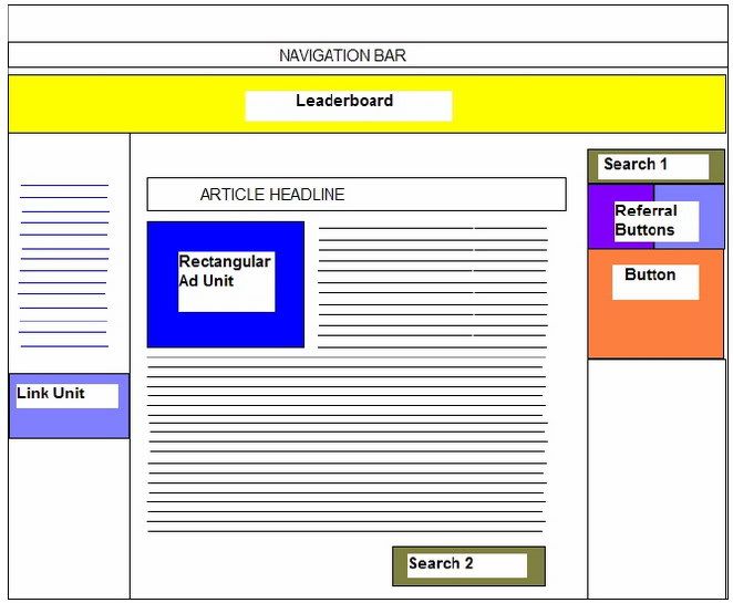
On a Web page that features just one article, you could place a leaderboard beneath the navigation bar, a rectangular ad unit embedded at the beginning of the article and a link unit in a list of links in the lefthand sidebar. On the right, you could place a search box and a couple of referral buttons to draw attention to a third ad unit located above another set of links, perhaps to archives, news or anything else. You could also try a second search box at the bottom of the page.
Possible alternatives to try:
10.8 Putting Multiple Ads In Blogs
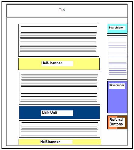
The best places to put ads on a blog is between the blog entries. Link units would probably be ideal here... but you’ve only got one of them. Instead, you could start with a halfbanner or even a full banner and use a link unit in between two of the blog entries. A search button can be placed at the top of a sidebar on the right with a skyscraper blended into a list of links, and the referral buttons at the bottom.
Possible alternatives to try:
10.9 Putting Multiple Ads In Merchant Sites
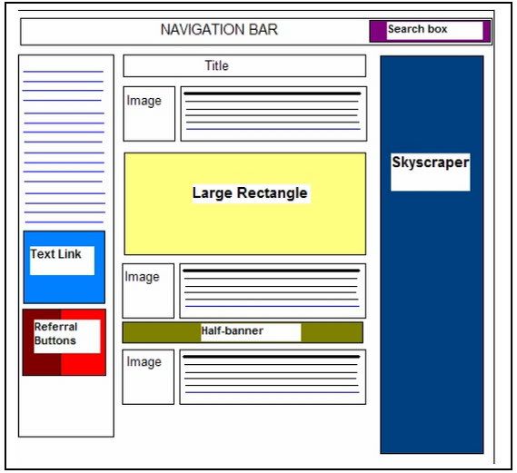
There are really two approaches you can take to using AdSense on merchant sites. The first is simply to treat them in the same way as blogs: put a link at the end of each section of advertising copy and place a banner or half banner beneath it. That ad unit should blend into the text above and below. You can use a skyscraper on the edge of the screen, a link unit beneath a list of navigation links, a search box at the top of the page and referral buttons wherever they can make the page look good.
Alternatively, you could use the images of your products to draw attention to your ads by placing small units near them, either directly beneath the pictures or right next to them. In the sample layout above, I’ve placed a large rectangular ad unit directly beneath a featured product. The feature would create the most attention and users would have read past it to reach the rest of the page. Whenever you’re using AdSense on merchant sites though do keep a close eye on the ads you’re serving; you don’t want to advertise your competitors!
Possible alternatives to try:
10.10 Ordering Your Ads
These strategies make for useful default placements. But there’s one more factor that you should consider when you’re planning your ads: the way that Google distributes ads to multiple units on a page. The first ad unit to appear on a Web page always shows the ads that placed the highest bids. In other words, the higher an ad appears on a page, the more that ad is worth. Because ads that are above the fold tend to get more clicks than those lower down the page, you won’t usually have to do a thing to make sure that the ads that receive the most clicks are those that pay the most.
If your Channels do show you that an ad unit at the bottom of the page is picking up more clicks than ad unit at the top of the page though, you might want try moving that unit to a higher position. Frankly, I doubt that’s going to happen very often. A bigger problem is if you’ve placed your ad units inside DIV tags, tables or other positioning codes. As far as AdSense is concerned, the first ad unit is the first one the robot comes across in the HTML code, even if that HTML code places the unit at the bottom of the page. When you place multiple ad units on a Web page then, it’s important to make sure that the AdSense codes appear in your HTML in the same order that they appear on your Web page. That should ensure that the ad units with the highest clickthrough rates are always the ones with the highest value ads.
3 ad units
2 AdSense for search boxes
1 link unit
2 AdSense referral buttons
2 Firefox referral buttons
2 Google Pack referral buttons
2 AdSense for search boxes
1 link unit
2 AdSense referral buttons
2 Firefox referral buttons
2 Google Pack referral buttons
What does this mean for web publishers? A real bonanza: you now have many more chances to hook readers with new ads as Google will show unique ads in each ad unit! With multiple ad blocks, you can also decide which ads are served in the best places for your site.
10.1 How Many Ads Is Too Many?
In general, I recommend that you put as many AdSense units on your page as possible. The more choices you give your users, the more likely they are to click. The only caveat to this is adblindness. Put lots of ads on your site and users are just going to ignore them. And when they ignore one unit, they’re likely to ignore them all. This can be more of a problem for small Web pages than for larger pages such as those on blogs. On a short page, all those different ads can quickly outweigh the content; on a long page, you can scatter them about so that they’re less likely to get in the way of a user’s reading. One great solution is to have a long home page with lots of ads but which contains only the headlines and the first paragraph or so from each article. To read more, the user has to click to a page with just that one article. That page would have fewer units. But because those units would be influenced by just one article, the ads would be better targeted.
10.2 What To Do With Three Ad Units
The actual number of ads that you’ll choose will depend on the design of your site. But considering the range of different formats, you should find it pretty easy to squeeze in at least two ad units and usually three. Most sites for example, have room for a leaderboard (although you should also experiment with a link unit to see which of the two in that position gives you the best results). It’s also not too difficult to insert a rectangular unit into an article. You can do that with just about any article. That’s two units already. The final unit, a button or vertical banner, could do very well in a sidebar. Most people choose to keep the ads far apart, but you can also have some pretty dramatic effects by putting your ad units together. This isn’t a strategy that’s going to work for everyone, but creating a zone at the top of your page maybe or between blog entries can really make those ads look like content. After all, users are used to seeing ads in single blocks. When they see a whole section of the page given over to ads, there’s a good chance they’ll assume it’s content and give it some extra attention.
10.3 Where To Put The Search Boxes
The search boxes are usually easier. Probably the most popular place for these is one of the top corners or in the side bar. You could try putting the second one at the bottom of the page if you want to give users somewhere to go when they’ve finished reading, but to be frank, I doubt if you’ll make any more money with a search box down there than you would from the one at the top. They’re a good way to capture revenue from users who don’t click on the ads and are about to leave, but I don’t think that putting two search boxes on a 88 page is going to give you more income than one. It’s possible and you can try it. But I wouldn’t expect any massive results.
10.4 Google Is Mean With The Link Units
Two search boxes might not make much of a difference, but I think that two link units might. They’re small enough to squeeze into all sorts of spots and they look so good at the top and bottom of a list of links that you could probably have fun with three or four of them. You’ve got one. Fortunately, you can put it just about anywhere. Because the link unit looks very different to an ad unit, I don’t think you have to worry too much about them competing for clicks and ending up with nothing. They go very well with other ad units.
10.5 Put Referral Buttons Near Ad Units
I think that the referral buttons are most eyecatching when kept together. That might mean you get fewer clicks on them one button looks like a special offer; two looks like a pair of ads but who cares? You’ll make more money with your ad units than with your referral buttons. Put a pair of referral buttons next to an ad unit and you’ll draw your user’s eyes in that direction. The products aren’t interesting enough for most of your users to click; the incomes aren’t high enough for you to care a great deal if they don’t; but where the buttons are really strong is in the design. You can double that power and draw on it by putting the buttons together and placing them near the ads that really can make money.
10.6 Putting It All Together
Deciding where to put one ad can often be difficult. There are so many different options. Get it wrong and it will cost you money. While having multiple ads lets you tempt users wherever they are on the page, it also compounds the problem. What’s the best combination of ads and where should the different ads go? Experimentation and close tracking is the only real way to know for your site but you have to start somewhere. I’ve put three suggested starting points below. These aren’t meant to be final versions that will yield you the greatest income. They’re just meant to get you started quickly. You can then try swapping the locations of different units and see how those changes affect your CTR.
10.7 Putting Multiple Ads In Articles

Fig. 10.1 Distributing multiple ads on an article Web page.
On a Web page that features just one article, you could place a leaderboard beneath the navigation bar, a rectangular ad unit embedded at the beginning of the article and a link unit in a list of links in the lefthand sidebar. On the right, you could place a search box and a couple of referral buttons to draw attention to a third ad unit located above another set of links, perhaps to archives, news or anything else. You could also try a second search box at the bottom of the page.
Possible alternatives to try:
- Swapping the leaderboard for a link unit;
- Replacing the link unit on the left with a vertical banner;
- Placing a halfbanner at the end of the article instead of the second search box;
- Moving the link unit on the left to the top of the sidebar;
- Using a skyscraper on the right instead of a button;
- Or just taking out some of the ads to see if that brings in more clicks.
10.8 Putting Multiple Ads In Blogs

Fig. 10.2 Distributing multiple ads on a blog.
The best places to put ads on a blog is between the blog entries. Link units would probably be ideal here... but you’ve only got one of them. Instead, you could start with a halfbanner or even a full banner and use a link unit in between two of the blog entries. A search button can be placed at the top of a sidebar on the right with a skyscraper blended into a list of links, and the referral buttons at the bottom.
Possible alternatives to try:
- Swapping the link unit for another ad unit and using a link unit in place of the skyscraper;
- Using banners instead of halfbanners;
- Embedding a rectangular ad unit into the text of the blog;
- Placing ad units next to photos in the blogs;
- Adding an extra search box to the bottom of the righthand sidebar.
10.9 Putting Multiple Ads In Merchant Sites

Fig. 10.3 Distributing multiple ads on a merchant site.
There are really two approaches you can take to using AdSense on merchant sites. The first is simply to treat them in the same way as blogs: put a link at the end of each section of advertising copy and place a banner or half banner beneath it. That ad unit should blend into the text above and below. You can use a skyscraper on the edge of the screen, a link unit beneath a list of navigation links, a search box at the top of the page and referral buttons wherever they can make the page look good.
Alternatively, you could use the images of your products to draw attention to your ads by placing small units near them, either directly beneath the pictures or right next to them. In the sample layout above, I’ve placed a large rectangular ad unit directly beneath a featured product. The feature would create the most attention and users would have read past it to reach the rest of the page. Whenever you’re using AdSense on merchant sites though do keep a close eye on the ads you’re serving; you don’t want to advertise your competitors!
Possible alternatives to try:
- Using a text link instead one of the ad units between the marketing copy;
- Placing a large picture of a product on a page... and an ad unit right next to it;
- Using banners instead of halfbanners;
- Placing a leaderboard either at the top of the page or at the bottom;
- Separating each piece of marketing copy with a large square unit. And if you’re worried you’ve put in too many ad units... just take one out and see if your CTR changes.
10.10 Ordering Your Ads
These strategies make for useful default placements. But there’s one more factor that you should consider when you’re planning your ads: the way that Google distributes ads to multiple units on a page. The first ad unit to appear on a Web page always shows the ads that placed the highest bids. In other words, the higher an ad appears on a page, the more that ad is worth. Because ads that are above the fold tend to get more clicks than those lower down the page, you won’t usually have to do a thing to make sure that the ads that receive the most clicks are those that pay the most.
If your Channels do show you that an ad unit at the bottom of the page is picking up more clicks than ad unit at the top of the page though, you might want try moving that unit to a higher position. Frankly, I doubt that’s going to happen very often. A bigger problem is if you’ve placed your ad units inside DIV tags, tables or other positioning codes. As far as AdSense is concerned, the first ad unit is the first one the robot comes across in the HTML code, even if that HTML code places the unit at the bottom of the page. When you place multiple ad units on a Web page then, it’s important to make sure that the AdSense codes appear in your HTML in the same order that they appear on your Web page. That should ensure that the ad units with the highest clickthrough rates are always the ones with the highest value ads.


