
3.1 Ad Formats: “Dress” your ads for success!
How would you like your ads served? Banners? Skyscrapers? Rectangles? Squares? What about borders and background colors? The choices can be overwhelming. Many people let Google decide for them preferring to stick with the default settings. Big mistake! From my own experience I can tell you that it’s like swapping a hundreddollar bill for a tendollar one. For almost one year I settled for just a tenth of what I could have been making just because I didn’t bother to control the looks and placement of my AdSense ads. The various ad formats, colors and their placement on the web page can be done in thousands of combinations. You can literally spend hours every day experimenting with every possible combination. But you don’t want to, do you? Let me give you a few ‘ground rules’ that have skyrocketed the CTRs on my topgrossing pages:
3.2 Don't "Look" Like An Ad People don't visit your website for ads.
They want good content. If you make the ads stick out with eyepopping colors, images or borders, that makes them easy to recognize as ads and people work extra hard to avoid them. The same goes for ads that are tucked away in the top, bottom or some other far corner of the page. So easy to ignore! If you want people to click, make the ads look like an integral part of your content. Today's visitors are blind to banners, mad at popups, weary of ads and skeptical of contests and giveaways. So how do you win their confidence? Simple. Don't make your ads look like ads! Let’s begin by reviewing each of the different types of ad available from AdSense and explaining their uses... then I’ll introduce you to a few simple choices that zoomed my CTRs to incredible heights.
3.3 Meet the AdSense Family
Google serves its ads in several flavors, with each of those flavors coming in a range of different shapes and sizes. It is very important to understand the differences between each of these ads. Some are ideal for particular locations. Some should never be used in certain locations. And some should be used very rarelyif at all. The sample page at www.google.com/adsense/adformats lets you see all of the different kinds of ads at once. It even has links to sample placements that demonstrate how the ads can be used. For the most part, I’d recommend that you ignore those sample placements. I’ll talk about location in more detail later in the book, but for now just bear in mind that many of the ads in the samples are just too out of the way to be noticed. You can use them as a starting point if you want but you’ll save yourself a lot of time and money by taking advantage of the experience of myself and others, and following the recommendations here.
3.4 Text Ads Google’s Finest
Text ads are probably the types of ad that you’re most familiar with. You get a box containing one or a number of ads with a linked headline, a brief description and a URL. You also get the “Ads by Google” notice that appears on all AdSense ads. (Google changed this notice recently and it now blends in much better than it used to.)
There are eight different types of text ad. The most popular is probably the leaderboard. At 728 x 90, it stretches pretty much across the screen and while it can be placed anywhere, it’s mostly used at the top of the page, above the main text.

On the whole though, I think you’ll probably find that one of the smaller ads, such as a banner or halfbanner might blend in more there and bring better results. And I think you can often forget about putting a leaderboard at the bottom of the page, despite what Google’s samples show you. It would certainly fit there but you have to be certain that people are going to reach the bottom of the page, especially a long page. You might find that only a small minority of readers would get that far, so you’re already reducing the percentage of readers who would click through. Overall, I’d say that leaderboards are most effective blended into the top of the page beneath the navigation bar and sometimes placed between forum entries.

Banners (468 x 60) and halfbanners (234 x 60) are much more flexible. Like leaderboards you can certainly put these sorts of ads at the top of the page, and lots of sites do it. Again, that’s something worth trying. You can put up a leaderboard for a week or so, swap it for a banner for another week or so, and compare the results.
But at the top of the page, I’d expect the leaderboard to do better. A banner or a halfbanner would leave too much space on one side and make the ad stand out. It would look like you’ve set aside an area of the page for advertising instead of for content. That would alert the reader that that section of the page is one that they can just ignore. When you’re looking for an ad to put in the middle of the page though, a halfbanner can be just the ticket. While a leaderboard will stretch over the sidebars of your site, just like the navigation bar, a 234 x 60 halfbanner will fit neatly into the text space on most sites.
This sort of ad should be your default option for the end of articles and the bottom of blog entries. But for the most part, stay away from the 468 x 60 banner ad block! One of the first things people do when they sign up for AdSense is to grab a 468 x 60 ad block. That’s a BIG mistake. I have a theory about why they do this. It’s the same theory that explains why the 468 x 60 block does not entice clicks.
Most site owners have the mindset that when they put Google ads on their site, they must place the code that conforms most to traditional web advertising. And that would be...? Yup, the 468 x 60, the ubiquitous banner format that we have all come to know and love and... IGNORE. Everyone is familiar with the 468 x 60.
And that’s exactly why the click through rate on this size is very low, even among advertisers who use images on their banners. The 468 x 60 blocks screams, "Hey! I am an advertisement! Whatever you do, DON'T click me. In fact, you should run from me as fast as you can!" In all but a few special cases, I have found the 468 x 60 ad block to be completely ineffective, and recommend ignoring it the same way your visitors do.
Now, that doesn’t mean you can never use it. You just have to know what you’re doing and do it smartly. You have to do everything you can to make sure that that ad block looks absolutely nothing like a traditional banner ad. At my site, WorldVillage.com, I’ve done that by surrounding the ad with text. Because there’s no border around the unit, the ads blend into the text and look almost as they’re a part of the article. If I had left that unit in the middle of some empty space at the top of the page for example it would have looked exactly like the sort of banner that users have trained themselves to avoid.
It wouldn’t have picked up any clicks at all. (Note, I could probably have used a halfbanner here too but in general, I like to give my users as wide a choice of ads to click as possible.) While this use of a 468 x 60 works for me and it can work for you too if you blend it into the page properly I’d stick to other formats, like the, half banner if you’re not 100 percent sure that you can pull it off. When this ad unit fails, it can fail big. Google also offers six different kinds of rectangular ads: buttons (125 x 125), small rectangles (180 x 150), medium rectangles (300 x 250), large rectangles (336 x 280), and two sizes of squares 250 x 250 and 200 x 200. In fact, all of the rectangles can be slotted into the same spots on the page... with the exception of the button.
Note how the ad links come immediately after an article link so that the ads look like part of the site. Probably the most common use of rectangles is at the beginning of articles. You can wrap the text around the ad, forcing the reader to look at it if he wants to read the article. That’s very effective. But you can really put these sorts of ads anywhere on the page. On my site, DealOfDay.com, I’ve put two rectangular ads right at the top of the page so that they take up the bulk of the space the user sees before he starts to scroll.
That’s a very aggressive approach that might not work on every site. It’s worth trying though because if it works for you, you can find that it brings in great revenues. If you’re wondering which size of ad would be best for the position you’ve got in mind, my advice is to start with the large rectangle, the 336 x 280.
Why should you choose the 336 x 280 ad block? Simple. It gets the most clicks! My studies have shown that this format looks most like real content added to a page. I’ve dabbled with every size Google offers and this is the size that consistently has the best results. Other people have told me the exact same thing. That’s all I need to know! Second best is the 300 x 250 rectangle.
This ad block size is really useful when you want to have two sets of ads side by side. They fit on most web pages just perfectly.
Buttons should generally be used in a different way to other rectangles. Like the halfbanners, they’re distinctive for their small size. While that means you could slot them in anywhere, I think they work best when slipped into the sidebars. For example, you might have a list of links to frequentlyread articles or other sites on one side of your page. Putting a button ad at the end of a list like that could help it to blend in well. The final types of text ads are those that run vertically.
These come in three sizes: skyscraper (120 x 600), wide skyscraper (160 x 600) and vertical banner (120 x 240). Clearly, these are useful options for filling up the sides of the page. I would also recommend using the 'wide skyscraper', textonly ads on the right hand edge of the screen in conjunction with the 3Way Matching I discuss later in the book. If you think about it, nearly all PC users are right handed (even lefthanded people like me control their mouse with their right hand because it's how we were 'brought up' to use a mouse.) By placing the ads on the right hand edge it's psychologically 'less distance' between your right hand and the screen.
This 'closeness' in my opinion makes the user feel more comfortable and therefore more likely to click through to a link. They feel more in control of their visit experience. On the whole, you can often divide sites into those that have plenty of content at the sides (especially on some blogs), and those that have nothing on the sides (like at JoelComm.com). I think putting vertical ads in space so that they form the border of the main text makes the page look a lot cleaner. But that doesn’t necessarily mean that they’re going to get more clicks. If you’re putting a vertical banner in an area where you have other content then just make sure, as always, that you blend them in well so that they look like the rest of your content.
3.5 Image Ads Built To Be Ignored
Text ads should always be your first pick when you start to load up your site. Image ads should always be your last choice.
A text ad offers many advantages over image ads:
A. With the right formatting, a text ad 'blends in' with your site content. An image ad will not give you the same freedom with its appearance, as the only thing you can play with is the size and positioning.
B. You can squeeze more text ads into the space that a conventional banner takes. People love to have more choices!
C. Properly formatted text ads don't look like clutter. Banners do!
D. People hate banners and avoid them at sight. Many tests confirm that people are much more receptive to text ads related with your content. I just can’t think of a reason why anyone would want to take an image ad from Google. Text ads perform so much better, in my opinion, you’re better off sticking with those and ignoring image ads altogether.
Dave Taylor, bestselling technology writer and AdSense partner, stands up for text ads in this article at: http://www.freewebmoney.com/000449.html You can read more of his AdSense articles on this page.
3.6 Video Ads There is however, one type of image ad that you should welcome on your website: Google’s new video ads. These are an excellent addition to Google’s inventory and for sites that get them, they can bring very impressive returns. Instead of receiving the sort of static image that just gets ignored, you’ll receive the opening still of an online video. The video is stored on Google’s servers so your download times won’t be affected, and it only plays when the user clicks the Play button, minimizing distraction to the user. That’s a good thing. If a user’s eyes keep drifting to a moving image when he’s trying to read your content, he’s going to get pretty frustrated and not want to come back.
And it’s fine too if you’re being paid on a CPM basis; you won’t care then how often someone sees the video. But you’re not always paid on a CPM basis; you might also be paid on a CPC basis. Unlike Google’s other ad formats though, you won’t be paid for just one click. Users first have to click the Play buttonwhich won’t pay you a dimeand then click either the screen while it’s playing or the link underneath the screen before you’ll earn money. In fact, you can’t even track the number of times the film is shown. (Although that does mean that you can watch the film yourself without getting rude messages from Google, and it also means that CPC advertisers are less likely to get free branding at the expense of your page space.)
That extra step might sound like it’s going to hit your clickthrough rate for that ad unit but I’m not sure that’s true. As soon as someone sees a button anywhere, they want to click it. In fact, I’m sure that if you put a big notice next to the Play button saying, “DO NOT PUSH THIS BUTTON” you can be sure that your clicks would go through the roof. (But don’t try it; it’s unlikely that Google will appreciate it.) People will want to click that Play button, and many of them will want to learn more about the company that created the ad. And even if your CTR does drop for that unit, it’s likely that the click price for video ads will be higher than for other units competing for that space. Video ads are more expensive to create than text or image ads.
That’s why they tend to be created by big companies like car giants or Disney. They might even be offering their television ads. If those corporations have gone to the trouble creating an original video ad or formatting a television ad for the Web, there’s a great chance that they’ll go to the trouble of outbidding their nearest rival for exposure. If you’re getting a video ad, track how long it appears on that page and compare the revenues it brings with the days on which no video ad appeared. You should expect to see a spike in earnings. If you don’t see that spike, you can always opt out. Unlike text or image ads though, there’s no guarantee you’re going to get a video ad. To qualify, you have to be opted in to receive image ads on an ad unit in one of these three sizes:
(It’s worth noting that with video ads, the bigger the format, the better the results). If you’re receiving those kinds of image ads and AdSense has a video ad to match your content, you might receive one. But what if you don’t? You’ll be receiving the sort of image ads that earn a poor clickthrough rate. That would cost you money. There are two things that you can do to minimize any losses from fishing for video ads and not getting them.
The first is to stop fishing fast. If a week has gone by and your image ad unit hasn’t acquired a Play button, it’s probably not going to. So turn that image ad back into a text ad. The second is to follow the strategy I use at DealofDay.com. I’ve placed two rectangular ads at the top of the page to make them unmissable but one of them is an image ad. Google no longer allows publishers to place related images right next to ad units to draw attention to them but you can put an image ad next to a text ad. If that image ad becomes a video ad, you’re going to earn more money. If it stays an image ad, it’s going to pull eyes into your ad zone.
This is about the only time I can think of when an image ad might be better than a text ad. And when you do get video ads, there are also a couple of things that you can do to make the most of them... Adding video to your Web pages for example, is a breeze. There are millions of clips available for free use on the Web, and there’s nothing to stop you from shooting your own short. If your site regularly receives a video ad from AdSense, placing one or two more videos on those pages would help the ad blend into the site and increase clicks. You could also encourage advertisers to build their own video ads specifically for your site. In Chapter 6, I talk about Google’s “Advertise on this site” feature and recommend that you make use of the landing page to help advertisers create effective ads for your site. You could also add a line or two there about video ads. Video ads are still fairly new on AdSense, but I’m really excited about them. I think we’re going to be seeing a lot more of them in the future and they’re going to really prove their worth.
3.7 Link Units
Great Little Stocking Fillers An ad format that has already proved its worth, when used correctly, is link units. If you’ve ever bought Christmas presents for children, you’ve probably bought stocking fillers. You dole out hundreds of bucks on some stateofthe art electronic gizmo, toss in a couple of toy cars that cost a dollar each just to fill up space and give the kid more to unwrap... then watch him spend 90 percent of his time playing with the car that cost 10 percent of your total gift budget. Ad Link units have the potential to be equally profitable. They’re very small, almost unnoticeable... but when used well, they can be extremely effective. Ad Link units let you place a box on your site that contains four or five links.
They come in sizes ranging from 20 x 90 to 200 x 90, and are really meant to be placed on a sidebar. Because you can place both Ad Link units as well as other ad units on the page, you might find that the choice helps: if a user doesn’t spot something interesting in one type of ad block, he might spot it on another. Where Ad Links differ from other types of ads is that they only display a list of topics that Google believes are relevant to the content of your pages. They don’t display the ads themselves. When a visitor clicks on a topic, Google pops up a new window with targeted ads. It can be argued that the Ad Links are ineffective because like video ads, people have to go through two clicks in order for you to get paid.
That’s right, once again, you’re only getting paid for the second click (but that does mean you can check to see which ads your users are being served.) But it can also be argued that if someone is taking the time to click on a topic, then they are probably very interested in the link, and are likely to click an actual advertisement on the resulting page. Some people have found that just about everyone who clicks on an Ad Link will click on the ads that appear on the next page. I have tested Ad Links on multiple sites and have seen vast differences in results. That makes it more difficult to say whether or not they are for you.
In the first case, I placed the Ad Links on an disguised link unit at informationbased site with a very general Worldvillage.com. audience. The results were nothing to write home about. Let's just say that you could just about buy a large candy bar with the CPM I saw.
In the second case, I placed the Ad Links on a product specific site with a narrow audience. The results were fantastic! We're talking about a CPM that is greater than what someone might make flipping burgers in one day. The conclusions should be obvious. If you’re going to use an Ad Links unit campaign.
You need to put them:
1. On a site with a specific field of interest. A general site will give you general ads and few clicks.
2. Above the fold with few other links. For Ad Links, this is crucial: If your users are going to click a link, it should be a link that gives you money. It’s also a good idea to keep your Ad Link units for sites with highpaying keywords. If someone comes to your site seeking out information or a product on a topnotch keyword, they tend to be more likely to click as a result. There are two kinds of link units: vertical units and horizontal units. Vertical link units are great slotted into sidebars. They just look like a natural extension of the link list. But horizontal link units can be at least as effective. Since they were introduced, they really have become an extremely useful tool. Some users have reported increases in CTR as high as 200 percent using these units! Instead of piling the links one on top of the otherwhich is great for putting above lists of links but stand out too clearly when placed in textthe horizontal ads blend in perfectly when placed on pages with articles.
You can still only use one Ad Link unit per page and users still have to click twice before you get paid but they’re definitely worth slipping into a long article. You probably shouldn’t put them at the bottom of a page where they’ll be very easy to miss, but there are plenty of other places where these sorts of ads can work very, very well. For example, a horizontal ad unit can be a great alternative to a leaderboard. It’s much more subtle and takes up less space on the page definitely something to experiment with to see which of the two brings you the highest revenues. Or you could use them to separate forum or blog entries.
As a horizontal unit, they can be very effective as frames that give people somewhere easy to go when they reach the end of a text unit. One great use for horizontal link units though is on directory pages. If you have a Web page that contains tables of links, slipping a horizontal link unit above or below them or both can make the ads look like a part of the directory. It almost makes you want to build a directory just to try it out!
Would a leaderboard have produced better revenues in that position? Again, something that can easily be tested.
3.8 Expanded Text Ads Shrinking Control Or Expanded Income?
Take a look at the ad format samples on the AdSense site and you’ll see a bunch of squares and rectangles filled with ads. Most of those ad units will contain more than one ad. On those units that do contain just the one ad, like the button or the halfbanner, the ad will fill the space neatly and look pretty subtle. You might be surprised then to put a skyscraper or a leaderboard on your site and find just one giant ad, written in supersized text. All the effort you’ve put into picking the right ad for your site, testing to see which formats work best and calculating which will give you the most clicks will have gone right out of the window. You’ve prepared your site to serve multiple ads that look like content, and instead you’re handing out a single ad that just screams “Don’t click me!” This can happen sometimes, but it’s not a reason to panic. It might even be a reason to celebrate. There are two possible reasons that Google is sending you these expanded text ads. The first possible reason is that you’ve been keywordtargeted. Google keeps track of your results (just like you should be doing) and tries to serve up the number of ads for your page that will bring in the
That expanded text ad strikes might be four ads in a unit. Frankly, I’m a touch skeptical that showing one ad is going to bring me more revenues than showing several. But I’m prepared to give AdSense the benefit of the doubt. If I see that Google is giving me one ad, I’ll compare the results for that one ad to the previous results that I’ve had serving multiple ads in the same unit. If I find that my revenues have dropped I can either block that ad using my filters or just ask AdSense not to give me any more single ads.
But if I find that the expanded text ad is giving me more money, I might still be worried. I know that users are more likely to click ads that look like content. I also know that they prefer to have a choice of ads rather than just one option. If I’m getting more clicks then with just one ad, it could well be that I have been doing something wrong with that ad unit in the past. I would want to look at how well it’s been optimized and whether it’s in the right place to bring in the best income. It could well be that this single ad is a highpayer and works better with little competition. But it could also be that getting that one ad is a warning that something was wrong with the way you’ve laid out that ad unit on your site. You might want to try some different strategies to see if they’ll increase your revenues when the multiple ads come back.
There is another possibility though. You might have been sitetargeted. This is a whole different ball game. It means that an advertiser has spotted your site and asked Google to run their ads on it on a payperimpression (CPM) basis. You’re no longer dealing with tempting people to click, so you don’t care how much your ad looks like an ad. In fact you might even want it to look like an ad, if that’s what will keep the advertiser happy. The most important point to bear in mind here is that you want to make sure that you’re not losing money. It might be very nice for the advertiser to have exclusive control over a particular spot on your page but if you can make more money serving CPC ads in that space, then you need to make sure that your site is working for you and not for the advertiser.
Again, watch your stats for a week and see if the revenues you receive for your impressions are higher than those you receive for your clicks. Most publishers do find that ads that pay by CPM pay better, especially sites with high traffic rates. After all, you’re getting paid for every visitor who comes to your site rather than just those that click, so all you have to do to increase your revenue is increase your traffic. As long as each impression pays more than you’re paying for the traffic, you’re going to be making a profit. That should be easy to calculate. If you find the revenues are lower though, then you’ll want to boot that ad off and go back to serving conventional ads. You can do that by opting out of showing sitetargeted ads (you’re automatically opted in).
In general, the biggest problem with these sorts of campaigns is not lower revenues; it’s that you’ve got no idea how long they’re going to last, which makes it difficult for you to take advantage of them. If you knew, for example, that you were going to get paid per impression for the next two weeks, then you’d want to buy in as much traffic as possible for that period, provided that you were paying less than you were earning. And because you don’t care about CTR, You could also lay off the optimization and focus on making your site more attractive to users. But you can’t tell when your site is going to be used for a CPM campaign and you can’t tell how long it’s going to last either. That means there’s little point in making major changes to your optimization; you might have to rebuild it the next day. The best strategy then when you spot a sitetargeted ad on your site is to keep a close eye on the cash flows. Buy in more traffic if you can do it profitably but for the most part, just enjoy the extra income!
3.9 Seasons Greeting With Themed Units
There is one more type of ad unit that you can use on your site. You just can’t use it all the time. Every time a holiday rolls around, Google brings out new ad units with seasonal themes. The designs themselves vary according to season and location (users in Europe, for example, won’t see Thanksgiving ads). In general, I always say that your ads should be unobtrusive but I like these themed ads. They’re eyecatching without looking like banners. When it’s holidaytime, it’s always worth checking out.
To sum up the different types of ad format then...
How would you like your ads served? Banners? Skyscrapers? Rectangles? Squares? What about borders and background colors? The choices can be overwhelming. Many people let Google decide for them preferring to stick with the default settings. Big mistake! From my own experience I can tell you that it’s like swapping a hundreddollar bill for a tendollar one. For almost one year I settled for just a tenth of what I could have been making just because I didn’t bother to control the looks and placement of my AdSense ads. The various ad formats, colors and their placement on the web page can be done in thousands of combinations. You can literally spend hours every day experimenting with every possible combination. But you don’t want to, do you? Let me give you a few ‘ground rules’ that have skyrocketed the CTRs on my topgrossing pages:
3.2 Don't "Look" Like An Ad People don't visit your website for ads.
They want good content. If you make the ads stick out with eyepopping colors, images or borders, that makes them easy to recognize as ads and people work extra hard to avoid them. The same goes for ads that are tucked away in the top, bottom or some other far corner of the page. So easy to ignore! If you want people to click, make the ads look like an integral part of your content. Today's visitors are blind to banners, mad at popups, weary of ads and skeptical of contests and giveaways. So how do you win their confidence? Simple. Don't make your ads look like ads! Let’s begin by reviewing each of the different types of ad available from AdSense and explaining their uses... then I’ll introduce you to a few simple choices that zoomed my CTRs to incredible heights.
3.3 Meet the AdSense Family
Google serves its ads in several flavors, with each of those flavors coming in a range of different shapes and sizes. It is very important to understand the differences between each of these ads. Some are ideal for particular locations. Some should never be used in certain locations. And some should be used very rarelyif at all. The sample page at www.google.com/adsense/adformats lets you see all of the different kinds of ads at once. It even has links to sample placements that demonstrate how the ads can be used. For the most part, I’d recommend that you ignore those sample placements. I’ll talk about location in more detail later in the book, but for now just bear in mind that many of the ads in the samples are just too out of the way to be noticed. You can use them as a starting point if you want but you’ll save yourself a lot of time and money by taking advantage of the experience of myself and others, and following the recommendations here.
3.4 Text Ads Google’s Finest
Text ads are probably the types of ad that you’re most familiar with. You get a box containing one or a number of ads with a linked headline, a brief description and a URL. You also get the “Ads by Google” notice that appears on all AdSense ads. (Google changed this notice recently and it now blends in much better than it used to.)
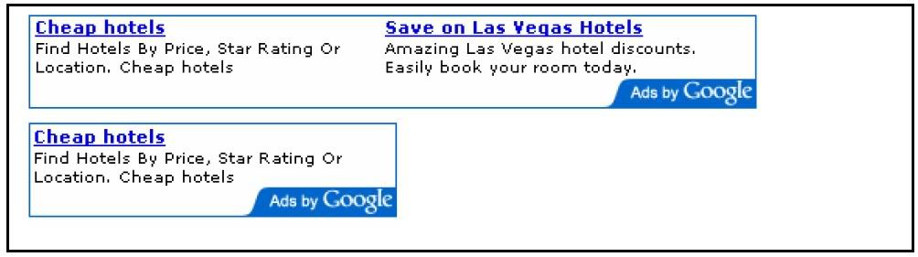
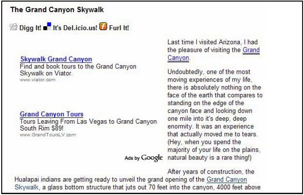
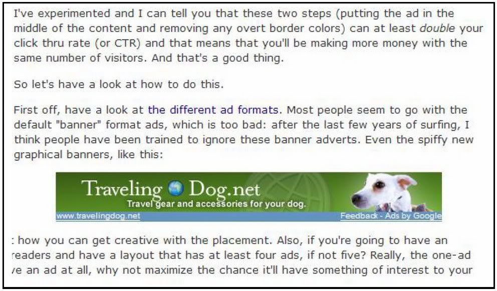
There are eight different types of text ad. The most popular is probably the leaderboard. At 728 x 90, it stretches pretty much across the screen and while it can be placed anywhere, it’s mostly used at the top of the page, above the main text.
Fig. 3.1 The leaderboard.
That’s a great location. It’s the first thing the reader sees and it offers a good selection of ads to choose from. When you’re just starting out and still experimenting with the types of ads that work best with your users, it’s a pretty good default to begin with. Of course, you can put it in other places too. Putting a leaderboard ad between forum entries for example can be a pretty good strategy sometimes and definitely worth trying.On the whole though, I think you’ll probably find that one of the smaller ads, such as a banner or halfbanner might blend in more there and bring better results. And I think you can often forget about putting a leaderboard at the bottom of the page, despite what Google’s samples show you. It would certainly fit there but you have to be certain that people are going to reach the bottom of the page, especially a long page. You might find that only a small minority of readers would get that far, so you’re already reducing the percentage of readers who would click through. Overall, I’d say that leaderboards are most effective blended into the top of the page beneath the navigation bar and sometimes placed between forum entries.
Fig. 3.2 A nicely optimized half banner on this Squidoo
Banners (468 x 60) and halfbanners (234 x 60) are much more flexible. Like leaderboards you can certainly put these sorts of ads at the top of the page, and lots of sites do it. Again, that’s something worth trying. You can put up a leaderboard for a week or so, swap it for a banner for another week or so, and compare the results.
Fig. 3.3 A banner and a halfbanner.
But at the top of the page, I’d expect the leaderboard to do better. A banner or a halfbanner would leave too much space on one side and make the ad stand out. It would look like you’ve set aside an area of the page for advertising instead of for content. That would alert the reader that that section of the page is one that they can just ignore. When you’re looking for an ad to put in the middle of the page though, a halfbanner can be just the ticket. While a leaderboard will stretch over the sidebars of your site, just like the navigation bar, a 234 x 60 halfbanner will fit neatly into the text space on most sites.
This sort of ad should be your default option for the end of articles and the bottom of blog entries. But for the most part, stay away from the 468 x 60 banner ad block! One of the first things people do when they sign up for AdSense is to grab a 468 x 60 ad block. That’s a BIG mistake. I have a theory about why they do this. It’s the same theory that explains why the 468 x 60 block does not entice clicks.
Most site owners have the mindset that when they put Google ads on their site, they must place the code that conforms most to traditional web advertising. And that would be...? Yup, the 468 x 60, the ubiquitous banner format that we have all come to know and love and... IGNORE. Everyone is familiar with the 468 x 60.
And that’s exactly why the click through rate on this size is very low, even among advertisers who use images on their banners. The 468 x 60 blocks screams, "Hey! I am an advertisement! Whatever you do, DON'T click me. In fact, you should run from me as fast as you can!" In all but a few special cases, I have found the 468 x 60 ad block to be completely ineffective, and recommend ignoring it the same way your visitors do.
Now, that doesn’t mean you can never use it. You just have to know what you’re doing and do it smartly. You have to do everything you can to make sure that that ad block looks absolutely nothing like a traditional banner ad. At my site, WorldVillage.com, I’ve done that by surrounding the ad with text. Because there’s no border around the unit, the ads blend into the text and look almost as they’re a part of the article. If I had left that unit in the middle of some empty space at the top of the page for example it would have looked exactly like the sort of banner that users have trained themselves to avoid.
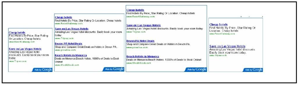
It wouldn’t have picked up any clicks at all. (Note, I could probably have used a halfbanner here too but in general, I like to give my users as wide a choice of ads to click as possible.) While this use of a 468 x 60 works for me and it can work for you too if you blend it into the page properly I’d stick to other formats, like the, half banner if you’re not 100 percent sure that you can pull it off. When this ad unit fails, it can fail big. Google also offers six different kinds of rectangular ads: buttons (125 x 125), small rectangles (180 x 150), medium rectangles (300 x 250), large rectangles (336 x 280), and two sizes of squares 250 x 250 and 200 x 200. In fact, all of the rectangles can be slotted into the same spots on the page... with the exception of the button.
Fig. 3.4 Banner ads at WorldVillage.com.
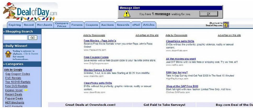
Note how the ad links come immediately after an article link so that the ads look like part of the site. Probably the most common use of rectangles is at the beginning of articles. You can wrap the text around the ad, forcing the reader to look at it if he wants to read the article. That’s very effective. But you can really put these sorts of ads anywhere on the page. On my site, DealOfDay.com, I’ve put two rectangular ads right at the top of the page so that they take up the bulk of the space the user sees before he starts to scroll.
That’s a very aggressive approach that might not work on every site. It’s worth trying though because if it works for you, you can find that it brings in great revenues. If you’re wondering which size of ad would be best for the position you’ve got in mind, my advice is to start with the large rectangle, the 336 x 280.
Fig. 3.5 Small, medium and large rectangles... and the square.
Why should you choose the 336 x 280 ad block? Simple. It gets the most clicks! My studies have shown that this format looks most like real content added to a page. I’ve dabbled with every size Google offers and this is the size that consistently has the best results. Other people have told me the exact same thing. That’s all I need to know! Second best is the 300 x 250 rectangle.
Fig. 3.6 A typical use of a rectangle embedded into the text at www.joelcomm.com
This ad block size is really useful when you want to have two sets of ads side by side. They fit on most web pages just perfectly.
Fig. 3.7 ... and an atypical use of two rectangles at Dealofday.com.
Buttons should generally be used in a different way to other rectangles. Like the halfbanners, they’re distinctive for their small size. While that means you could slot them in anywhere, I think they work best when slipped into the sidebars. For example, you might have a list of links to frequentlyread articles or other sites on one side of your page. Putting a button ad at the end of a list like that could help it to blend in well. The final types of text ads are those that run vertically.
These come in three sizes: skyscraper (120 x 600), wide skyscraper (160 x 600) and vertical banner (120 x 240). Clearly, these are useful options for filling up the sides of the page. I would also recommend using the 'wide skyscraper', textonly ads on the right hand edge of the screen in conjunction with the 3Way Matching I discuss later in the book. If you think about it, nearly all PC users are right handed (even lefthanded people like me control their mouse with their right hand because it's how we were 'brought up' to use a mouse.) By placing the ads on the right hand edge it's psychologically 'less distance' between your right hand and the screen.
This 'closeness' in my opinion makes the user feel more comfortable and therefore more likely to click through to a link. They feel more in control of their visit experience. On the whole, you can often divide sites into those that have plenty of content at the sides (especially on some blogs), and those that have nothing on the sides (like at JoelComm.com). I think putting vertical ads in space so that they form the border of the main text makes the page look a lot cleaner. But that doesn’t necessarily mean that they’re going to get more clicks. If you’re putting a vertical banner in an area where you have other content then just make sure, as always, that you blend them in well so that they look like the rest of your content.
3.5 Image Ads Built To Be Ignored
Text ads should always be your first pick when you start to load up your site. Image ads should always be your last choice.
A text ad offers many advantages over image ads:
A. With the right formatting, a text ad 'blends in' with your site content. An image ad will not give you the same freedom with its appearance, as the only thing you can play with is the size and positioning.
B. You can squeeze more text ads into the space that a conventional banner takes. People love to have more choices!
C. Properly formatted text ads don't look like clutter. Banners do!
D. People hate banners and avoid them at sight. Many tests confirm that people are much more receptive to text ads related with your content. I just can’t think of a reason why anyone would want to take an image ad from Google. Text ads perform so much better, in my opinion, you’re better off sticking with those and ignoring image ads altogether.
Fig. 3.8 This banner ad stands out, but will it get clicked?
Dave Taylor, bestselling technology writer and AdSense partner, stands up for text ads in this article at: http://www.freewebmoney.com/000449.html You can read more of his AdSense articles on this page.
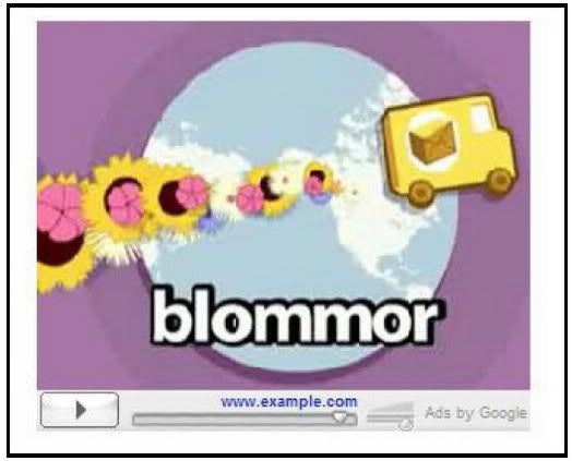
3.6 Video Ads There is however, one type of image ad that you should welcome on your website: Google’s new video ads. These are an excellent addition to Google’s inventory and for sites that get them, they can bring very impressive returns. Instead of receiving the sort of static image that just gets ignored, you’ll receive the opening still of an online video. The video is stored on Google’s servers so your download times won’t be affected, and it only plays when the user clicks the Play button, minimizing distraction to the user. That’s a good thing. If a user’s eyes keep drifting to a moving image when he’s trying to read your content, he’s going to get pretty frustrated and not want to come back.
Fig. 3.9 Playperclick: a scene from Google’s sample video ad.
And it’s fine too if you’re being paid on a CPM basis; you won’t care then how often someone sees the video. But you’re not always paid on a CPM basis; you might also be paid on a CPC basis. Unlike Google’s other ad formats though, you won’t be paid for just one click. Users first have to click the Play buttonwhich won’t pay you a dimeand then click either the screen while it’s playing or the link underneath the screen before you’ll earn money. In fact, you can’t even track the number of times the film is shown. (Although that does mean that you can watch the film yourself without getting rude messages from Google, and it also means that CPC advertisers are less likely to get free branding at the expense of your page space.)
That extra step might sound like it’s going to hit your clickthrough rate for that ad unit but I’m not sure that’s true. As soon as someone sees a button anywhere, they want to click it. In fact, I’m sure that if you put a big notice next to the Play button saying, “DO NOT PUSH THIS BUTTON” you can be sure that your clicks would go through the roof. (But don’t try it; it’s unlikely that Google will appreciate it.) People will want to click that Play button, and many of them will want to learn more about the company that created the ad. And even if your CTR does drop for that unit, it’s likely that the click price for video ads will be higher than for other units competing for that space. Video ads are more expensive to create than text or image ads.
That’s why they tend to be created by big companies like car giants or Disney. They might even be offering their television ads. If those corporations have gone to the trouble creating an original video ad or formatting a television ad for the Web, there’s a great chance that they’ll go to the trouble of outbidding their nearest rival for exposure. If you’re getting a video ad, track how long it appears on that page and compare the revenues it brings with the days on which no video ad appeared. You should expect to see a spike in earnings. If you don’t see that spike, you can always opt out. Unlike text or image ads though, there’s no guarantee you’re going to get a video ad. To qualify, you have to be opted in to receive image ads on an ad unit in one of these three sizes:
- Medium Rectangle (300 X 250)
- Large Rectangle (336 X 280)
- Square (250 X 250)
(It’s worth noting that with video ads, the bigger the format, the better the results). If you’re receiving those kinds of image ads and AdSense has a video ad to match your content, you might receive one. But what if you don’t? You’ll be receiving the sort of image ads that earn a poor clickthrough rate. That would cost you money. There are two things that you can do to minimize any losses from fishing for video ads and not getting them.
The first is to stop fishing fast. If a week has gone by and your image ad unit hasn’t acquired a Play button, it’s probably not going to. So turn that image ad back into a text ad. The second is to follow the strategy I use at DealofDay.com. I’ve placed two rectangular ads at the top of the page to make them unmissable but one of them is an image ad. Google no longer allows publishers to place related images right next to ad units to draw attention to them but you can put an image ad next to a text ad. If that image ad becomes a video ad, you’re going to earn more money. If it stays an image ad, it’s going to pull eyes into your ad zone.
This is about the only time I can think of when an image ad might be better than a text ad. And when you do get video ads, there are also a couple of things that you can do to make the most of them... Adding video to your Web pages for example, is a breeze. There are millions of clips available for free use on the Web, and there’s nothing to stop you from shooting your own short. If your site regularly receives a video ad from AdSense, placing one or two more videos on those pages would help the ad blend into the site and increase clicks. You could also encourage advertisers to build their own video ads specifically for your site. In Chapter 6, I talk about Google’s “Advertise on this site” feature and recommend that you make use of the landing page to help advertisers create effective ads for your site. You could also add a line or two there about video ads. Video ads are still fairly new on AdSense, but I’m really excited about them. I think we’re going to be seeing a lot more of them in the future and they’re going to really prove their worth.
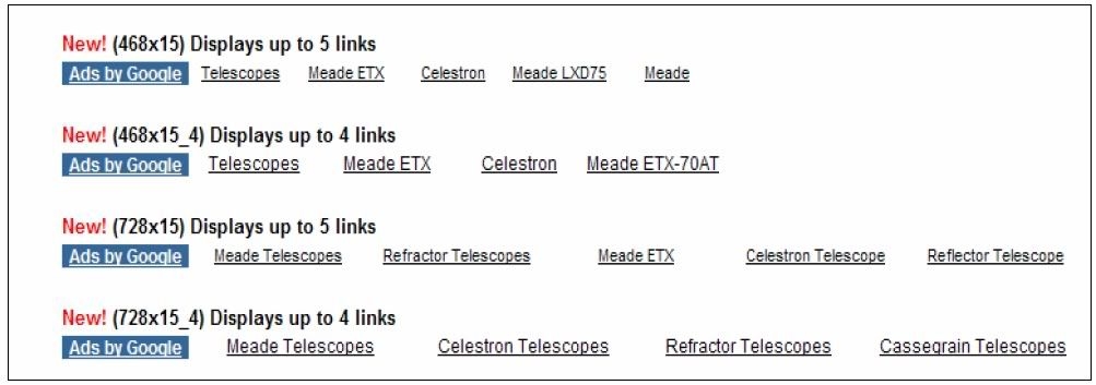
3.7 Link Units
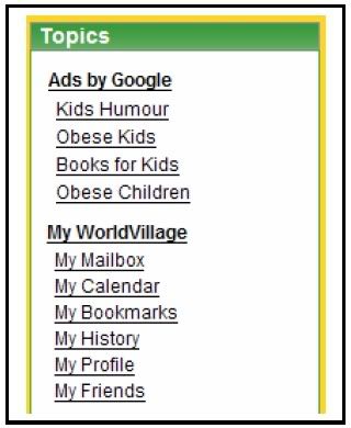
Great Little Stocking Fillers An ad format that has already proved its worth, when used correctly, is link units. If you’ve ever bought Christmas presents for children, you’ve probably bought stocking fillers. You dole out hundreds of bucks on some stateofthe art electronic gizmo, toss in a couple of toy cars that cost a dollar each just to fill up space and give the kid more to unwrap... then watch him spend 90 percent of his time playing with the car that cost 10 percent of your total gift budget. Ad Link units have the potential to be equally profitable. They’re very small, almost unnoticeable... but when used well, they can be extremely effective. Ad Link units let you place a box on your site that contains four or five links.
They come in sizes ranging from 20 x 90 to 200 x 90, and are really meant to be placed on a sidebar. Because you can place both Ad Link units as well as other ad units on the page, you might find that the choice helps: if a user doesn’t spot something interesting in one type of ad block, he might spot it on another. Where Ad Links differ from other types of ads is that they only display a list of topics that Google believes are relevant to the content of your pages. They don’t display the ads themselves. When a visitor clicks on a topic, Google pops up a new window with targeted ads. It can be argued that the Ad Links are ineffective because like video ads, people have to go through two clicks in order for you to get paid.
That’s right, once again, you’re only getting paid for the second click (but that does mean you can check to see which ads your users are being served.) But it can also be argued that if someone is taking the time to click on a topic, then they are probably very interested in the link, and are likely to click an actual advertisement on the resulting page. Some people have found that just about everyone who clicks on an Ad Link will click on the ads that appear on the next page. I have tested Ad Links on multiple sites and have seen vast differences in results. That makes it more difficult to say whether or not they are for you.
Fig. 3.10 A cunningly
In the first case, I placed the Ad Links on an disguised link unit at informationbased site with a very general Worldvillage.com. audience. The results were nothing to write home about. Let's just say that you could just about buy a large candy bar with the CPM I saw.
In the second case, I placed the Ad Links on a product specific site with a narrow audience. The results were fantastic! We're talking about a CPM that is greater than what someone might make flipping burgers in one day. The conclusions should be obvious. If you’re going to use an Ad Links unit campaign.
You need to put them:
1. On a site with a specific field of interest. A general site will give you general ads and few clicks.
2. Above the fold with few other links. For Ad Links, this is crucial: If your users are going to click a link, it should be a link that gives you money. It’s also a good idea to keep your Ad Link units for sites with highpaying keywords. If someone comes to your site seeking out information or a product on a topnotch keyword, they tend to be more likely to click as a result. There are two kinds of link units: vertical units and horizontal units. Vertical link units are great slotted into sidebars. They just look like a natural extension of the link list. But horizontal link units can be at least as effective. Since they were introduced, they really have become an extremely useful tool. Some users have reported increases in CTR as high as 200 percent using these units! Instead of piling the links one on top of the otherwhich is great for putting above lists of links but stand out too clearly when placed in textthe horizontal ads blend in perfectly when placed on pages with articles.
Fig. 3.11 Horizontal Ad Link units are great for inserting into articles and show very clearly which keywords your site is generating.
You can still only use one Ad Link unit per page and users still have to click twice before you get paid but they’re definitely worth slipping into a long article. You probably shouldn’t put them at the bottom of a page where they’ll be very easy to miss, but there are plenty of other places where these sorts of ads can work very, very well. For example, a horizontal ad unit can be a great alternative to a leaderboard. It’s much more subtle and takes up less space on the page definitely something to experiment with to see which of the two brings you the highest revenues. Or you could use them to separate forum or blog entries.
As a horizontal unit, they can be very effective as frames that give people somewhere easy to go when they reach the end of a text unit. One great use for horizontal link units though is on directory pages. If you have a Web page that contains tables of links, slipping a horizontal link unit above or below them or both can make the ads look like a part of the directory. It almost makes you want to build a directory just to try it out!
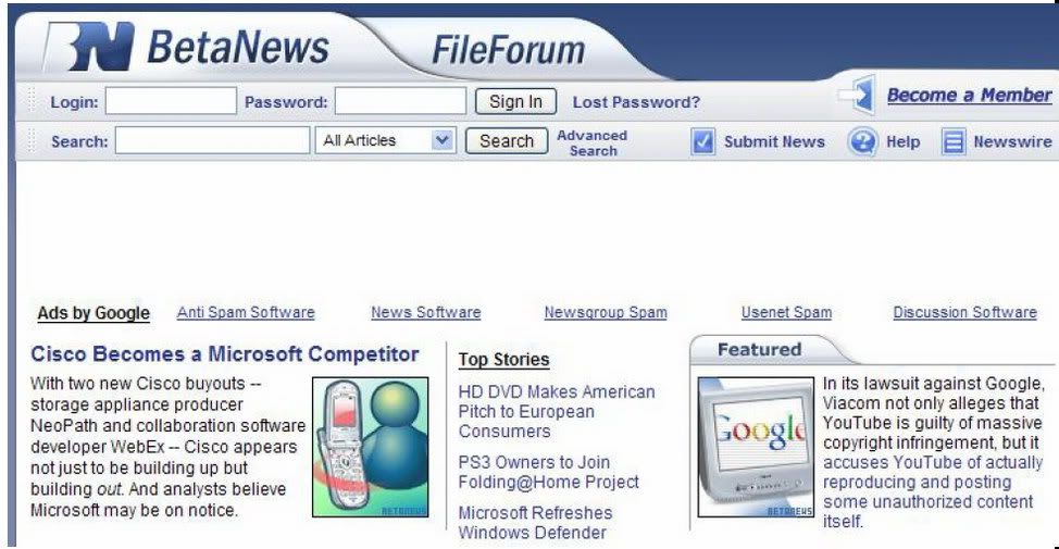
Fig. 3.12 A horizontal link unit at the top of the page at BetaNews.com.
Would a leaderboard have produced better revenues in that position? Again, something that can easily be tested.
3.8 Expanded Text Ads Shrinking Control Or Expanded Income?
Take a look at the ad format samples on the AdSense site and you’ll see a bunch of squares and rectangles filled with ads. Most of those ad units will contain more than one ad. On those units that do contain just the one ad, like the button or the halfbanner, the ad will fill the space neatly and look pretty subtle. You might be surprised then to put a skyscraper or a leaderboard on your site and find just one giant ad, written in supersized text. All the effort you’ve put into picking the right ad for your site, testing to see which formats work best and calculating which will give you the most clicks will have gone right out of the window. You’ve prepared your site to serve multiple ads that look like content, and instead you’re handing out a single ad that just screams “Don’t click me!” This can happen sometimes, but it’s not a reason to panic. It might even be a reason to celebrate. There are two possible reasons that Google is sending you these expanded text ads. The first possible reason is that you’ve been keywordtargeted. Google keeps track of your results (just like you should be doing) and tries to serve up the number of ads for your page that will bring in the
Fig. 3.13 You can’t miss that! An highest amount of income.
That expanded text ad strikes might be four ads in a unit. Frankly, I’m a touch skeptical that showing one ad is going to bring me more revenues than showing several. But I’m prepared to give AdSense the benefit of the doubt. If I see that Google is giving me one ad, I’ll compare the results for that one ad to the previous results that I’ve had serving multiple ads in the same unit. If I find that my revenues have dropped I can either block that ad using my filters or just ask AdSense not to give me any more single ads.
But if I find that the expanded text ad is giving me more money, I might still be worried. I know that users are more likely to click ads that look like content. I also know that they prefer to have a choice of ads rather than just one option. If I’m getting more clicks then with just one ad, it could well be that I have been doing something wrong with that ad unit in the past. I would want to look at how well it’s been optimized and whether it’s in the right place to bring in the best income. It could well be that this single ad is a highpayer and works better with little competition. But it could also be that getting that one ad is a warning that something was wrong with the way you’ve laid out that ad unit on your site. You might want to try some different strategies to see if they’ll increase your revenues when the multiple ads come back.
There is another possibility though. You might have been sitetargeted. This is a whole different ball game. It means that an advertiser has spotted your site and asked Google to run their ads on it on a payperimpression (CPM) basis. You’re no longer dealing with tempting people to click, so you don’t care how much your ad looks like an ad. In fact you might even want it to look like an ad, if that’s what will keep the advertiser happy. The most important point to bear in mind here is that you want to make sure that you’re not losing money. It might be very nice for the advertiser to have exclusive control over a particular spot on your page but if you can make more money serving CPC ads in that space, then you need to make sure that your site is working for you and not for the advertiser.
Again, watch your stats for a week and see if the revenues you receive for your impressions are higher than those you receive for your clicks. Most publishers do find that ads that pay by CPM pay better, especially sites with high traffic rates. After all, you’re getting paid for every visitor who comes to your site rather than just those that click, so all you have to do to increase your revenue is increase your traffic. As long as each impression pays more than you’re paying for the traffic, you’re going to be making a profit. That should be easy to calculate. If you find the revenues are lower though, then you’ll want to boot that ad off and go back to serving conventional ads. You can do that by opting out of showing sitetargeted ads (you’re automatically opted in).
In general, the biggest problem with these sorts of campaigns is not lower revenues; it’s that you’ve got no idea how long they’re going to last, which makes it difficult for you to take advantage of them. If you knew, for example, that you were going to get paid per impression for the next two weeks, then you’d want to buy in as much traffic as possible for that period, provided that you were paying less than you were earning. And because you don’t care about CTR, You could also lay off the optimization and focus on making your site more attractive to users. But you can’t tell when your site is going to be used for a CPM campaign and you can’t tell how long it’s going to last either. That means there’s little point in making major changes to your optimization; you might have to rebuild it the next day. The best strategy then when you spot a sitetargeted ad on your site is to keep a close eye on the cash flows. Buy in more traffic if you can do it profitably but for the most part, just enjoy the extra income!
3.9 Seasons Greeting With Themed Units
There is one more type of ad unit that you can use on your site. You just can’t use it all the time. Every time a holiday rolls around, Google brings out new ad units with seasonal themes. The designs themselves vary according to season and location (users in Europe, for example, won’t see Thanksgiving ads). In general, I always say that your ads should be unobtrusive but I like these themed ads. They’re eyecatching without looking like banners. When it’s holidaytime, it’s always worth checking out.
Fig. 3.14 A the format page again and seeing what’s Thanksgiving ad that available. isn’t a turkey.
To sum up the different types of ad format then...
- Leaderboards are best at the top of the page;
- Squares and rectangles can be embedded into text itself;
- Vertical ads and buttons should slip down the side of the page;
- Vertical link units should be placed next to link lists;
- Horizontal link units can go at the top of the page, between blog entries or above and below directories;
- Image ads should rarely be used at all;
- Themed ads can be slotted in at holiday time;
- And Video ads should be used whenever possible.

