
4.1 Design Your Website To Highlight Adsense
I once went to a fashion show where each model wore the exact same black outfit for the entire duration of the show. Boring? Hardly! The show was intended to showcase platinum jewelry, and the outfits were designed to enhance the jewelry instead of distracting the audience. You don’t have to make all the pages on your website identical (or black). But you do want to make sure that the look of your page draws attention to the ads and makes them appear as attractive and as valuable as platinum jewelry. Many websites have strong graphic elements that catch the eye usually at the expense of the AdSense units. If you're using AdSense, be judicious in the selection of fonts, font size, colors, images, tables and other visual aspects of your website. Draw subtle attention to your AdSense units. Make them the stars of your show!
4.2 Make The Border Go!
You can more than DOUBLE your clickthroughs with this one simple tweak! Even before the Internet, ads in newspapers and magazines were marked off with a thick, heavy border. No wonder borders and boxes have come to symbolize advertising messages. Ads with prominent borders make your pages look cluttered. They distract the eye from the ad text, while marking off the ad blocks from the rest of the content. Google provides an extensive color palette in your administrative area. Use it to tweak the look of your ads to suit your web page. With just one simple click, you can match the color of your ad's border with the background color of your web page. When the border blends with the background, it frees up loads of space. The page looks instantly neater and the ads look more inviting. Make sure you also pick a matching background color for the ad. The ad's background must match the page background on which the ad will appear.
If your page background is white, you can instantly see the results with the Example ad next to the color palette. If the ad appears in a table, match the table background color with the ad background color. The key is to blend the background and border color with the page, so that the text looks like an integral part of your web content.
4.3 Text Is Design Too!
That's right: the text size, font, color and the color of your ads must match the other text elements. If the text color of the ads is the same as the text in the body of your page, it’ll help the ads blend into the site and make the reader feel that you’ve endorsed them. And if the size of the font in the ads is the same as the size of the main body of the content, it will have the same effect: they’ll look like part of your site and not something brought in by Google. That’s the sort of blending that translates into clicks.
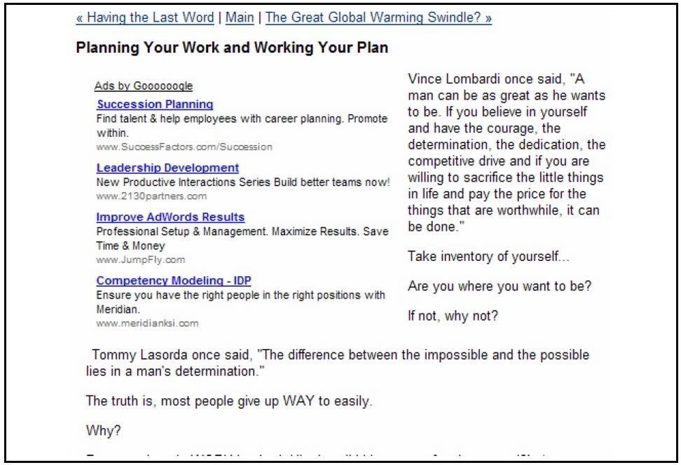
Fig 4.4 Format your text ads to maximize clicks! On my blog, I have removed the border and matched the ad’s background color and fonts to my content. See more at http://www.joelcomm.com This 3way matching (titles, text and background) can generate excellent clickthrough rates. Too many text styles add clutter and can confuse your visitors. Instead, try every legitimate way to make the ads look like a part of your web content. In other words use the colors to make sure that your ads don't look like ads!
4.4 Blue Is Best So you want to get rid of the border.
You want to get your ads the same color as the text on the rest of your page and the background matching the background color of your Web page. But what about the link itself, the line the user is actually going to click? What color should that be? That’s an easy one: blue. I used to say that all the text in the ad should match the text on your page, including the link. After seeing an article about the benefits of keeping the links blue and testing extensively I don’t say that any more. The logic is that users have come to expect links on websites to be blue. Just as they expect stop signs to be red and warning signs to be yellow, so they expect their links to blue. That means people are more likely to click on a blue link than a link in any other color. The line in your AdSense code that sets the color of your link is the one that says: Google_color_link = “#color”; “#color” is the hexadecimal number for the color you want to use. You should make sure that number is #0000FF. Keep your link blue and you can experience an increase in clickthroughs as high as 25 percent!
4.5 Where Did My URL Go?
You can change the color of your text and you can make sure that your links scream, “I’m a FREE road to where you want to go!” But you still have to display the URL. It’s one of Google’s rules. But you don’t have to display it in a way that people can see it. One legitimate trick to make the clickthrough link less obtrusive is to change the URL display color to match the text description color. Now the link will blend in with the text description and the eye will be drawn to the hyperlink instead of the URL. Google provides these tools for you. Why not use them? Note that the 728 x 90 leaderboard and the 468 x 60 banner do not display the URL line by Google’s design. It is not a mistake and you will not get in trouble for the URL not appearing with these ad blocks. It’s just the way it is.
4.6 Deliberate Mismatching
When it comes to choosing colors, I recommend 3way matching and using blue for the links. But there is another strategy that you can use. You can deliberately mismatch your ad colors and styles, provided you keep it to the top of your page. This distinction generates two powerful 'zones' and therefore two types of experience for the visitor. The first zone is always at the top of the first page, above the main site banner. The titles and text colors match colors found in the banner graphic heading. (Important the URL links are hidden, so only certain text ads will allow you to do this.) The end result is that these ads, placed above the banner graphic look like key control points for your site and are just more likely to be clicked. The visitor feels that they are visiting another major area of that site.
Implementing this design increased their revenues FIVEFOLD!
I once went to a fashion show where each model wore the exact same black outfit for the entire duration of the show. Boring? Hardly! The show was intended to showcase platinum jewelry, and the outfits were designed to enhance the jewelry instead of distracting the audience. You don’t have to make all the pages on your website identical (or black). But you do want to make sure that the look of your page draws attention to the ads and makes them appear as attractive and as valuable as platinum jewelry. Many websites have strong graphic elements that catch the eye usually at the expense of the AdSense units. If you're using AdSense, be judicious in the selection of fonts, font size, colors, images, tables and other visual aspects of your website. Draw subtle attention to your AdSense units. Make them the stars of your show!
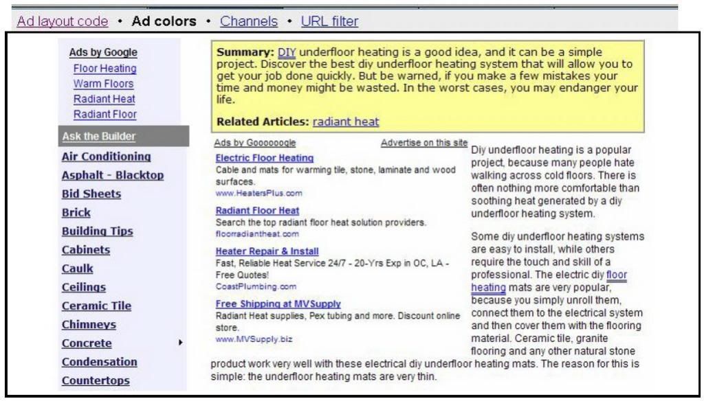
Fig. 4.1 On this website, Tim Carter employs subtle design and placement to make AdSense the center of attraction. Check it out at: http://www.askthebuilder.com
4.2 Make The Border Go!
You can more than DOUBLE your clickthroughs with this one simple tweak! Even before the Internet, ads in newspapers and magazines were marked off with a thick, heavy border. No wonder borders and boxes have come to symbolize advertising messages. Ads with prominent borders make your pages look cluttered. They distract the eye from the ad text, while marking off the ad blocks from the rest of the content. Google provides an extensive color palette in your administrative area. Use it to tweak the look of your ads to suit your web page. With just one simple click, you can match the color of your ad's border with the background color of your web page. When the border blends with the background, it frees up loads of space. The page looks instantly neater and the ads look more inviting. Make sure you also pick a matching background color for the ad. The ad's background must match the page background on which the ad will appear.
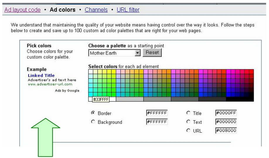
Fig. 4.2 It's always easier to work with a white background.
If your page background is white, you can instantly see the results with the Example ad next to the color palette. If the ad appears in a table, match the table background color with the ad background color. The key is to blend the background and border color with the page, so that the text looks like an integral part of your web content.
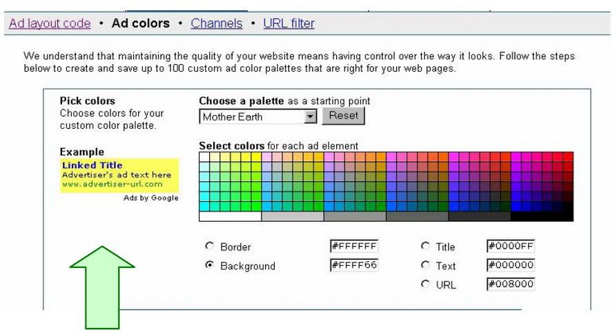
Fig. 4.3 Don't forget to match the background color for your ad with the background color of your web page. Even with a matching border, the ad in the Example above sticks out against the white background.
4.3 Text Is Design Too!
That's right: the text size, font, color and the color of your ads must match the other text elements. If the text color of the ads is the same as the text in the body of your page, it’ll help the ads blend into the site and make the reader feel that you’ve endorsed them. And if the size of the font in the ads is the same as the size of the main body of the content, it will have the same effect: they’ll look like part of your site and not something brought in by Google. That’s the sort of blending that translates into clicks.
Fig 4.4 Format your text ads to maximize clicks! On my blog, I have removed the border and matched the ad’s background color and fonts to my content. See more at http://www.joelcomm.com This 3way matching (titles, text and background) can generate excellent clickthrough rates. Too many text styles add clutter and can confuse your visitors. Instead, try every legitimate way to make the ads look like a part of your web content. In other words use the colors to make sure that your ads don't look like ads!
4.4 Blue Is Best So you want to get rid of the border.
You want to get your ads the same color as the text on the rest of your page and the background matching the background color of your Web page. But what about the link itself, the line the user is actually going to click? What color should that be? That’s an easy one: blue. I used to say that all the text in the ad should match the text on your page, including the link. After seeing an article about the benefits of keeping the links blue and testing extensively I don’t say that any more. The logic is that users have come to expect links on websites to be blue. Just as they expect stop signs to be red and warning signs to be yellow, so they expect their links to blue. That means people are more likely to click on a blue link than a link in any other color. The line in your AdSense code that sets the color of your link is the one that says: Google_color_link = “#color”; “#color” is the hexadecimal number for the color you want to use. You should make sure that number is #0000FF. Keep your link blue and you can experience an increase in clickthroughs as high as 25 percent!
4.5 Where Did My URL Go?
You can change the color of your text and you can make sure that your links scream, “I’m a FREE road to where you want to go!” But you still have to display the URL. It’s one of Google’s rules. But you don’t have to display it in a way that people can see it. One legitimate trick to make the clickthrough link less obtrusive is to change the URL display color to match the text description color. Now the link will blend in with the text description and the eye will be drawn to the hyperlink instead of the URL. Google provides these tools for you. Why not use them? Note that the 728 x 90 leaderboard and the 468 x 60 banner do not display the URL line by Google’s design. It is not a mistake and you will not get in trouble for the URL not appearing with these ad blocks. It’s just the way it is.
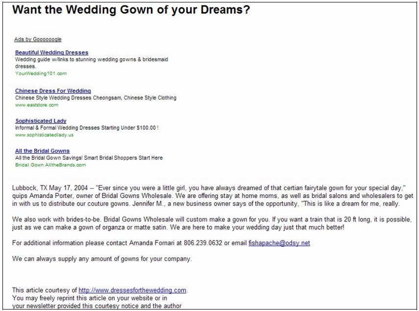
4.6 Deliberate Mismatching
When it comes to choosing colors, I recommend 3way matching and using blue for the links. But there is another strategy that you can use. You can deliberately mismatch your ad colors and styles, provided you keep it to the top of your page. This distinction generates two powerful 'zones' and therefore two types of experience for the visitor. The first zone is always at the top of the first page, above the main site banner. The titles and text colors match colors found in the banner graphic heading. (Important the URL links are hidden, so only certain text ads will allow you to do this.) The end result is that these ads, placed above the banner graphic look like key control points for your site and are just more likely to be clicked. The visitor feels that they are visiting another major area of that site.
Fig. 4.5 www.dressesforthewedding.com has two zones: an ad zone at the top and a free article beneath.
Implementing this design increased their revenues FIVEFOLD!

