
5.1 Ad Placement: Where To Put Your Ads?
Location is everything. The world's best ad won't deliver if it isn't visible in the first place. But after much experimentation with Google AdSense, I know that the most visible ads aren't always the most effective. In fact, they're likely to get ignored as 'blatant advertising'. What does work is wise placement. Put them where your content is most likely to interest and engage your visitors. You can create several 'points of interest' with the wise use of graphics, tables and other layout techniques. Once you have your visitor's attention with engaging and meaningful content, they are most likely to read and click on relevant ads. And that is precisely what Google wants "educated" clicks from real prospects, not random visits from bored people. Here are a few simple tips to make your ads 'click'!
5.2 Go With The 'Flow' Identify the reading patterns of your visitors.
What draws their attention first? What makes them 'click'? Like I said, you want to put your ads in areas that draw your visitors in with interesting content. There’s no point in putting your ads in some out of the way place where no one ever looks. Your users will follow your content, so you need to make sure that your ads follow that content too. Look at the design and layout of your webpage, identify the places that you think most of your users look and mark each of them as a likely spot to put your ads. Google actually offers a pretty neat tool to help you identify where your users are most likely to look. Their heat map at https://www.google.com/support/adsense/bin/static.py?page=tips.html sums up the options pretty well:
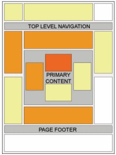
Fig. 5.1 Google’s Heat Map shows an “average” site’s hot spots.
The darker areas are the regions where people look most frequently. But remember, no site is average. Where do your visitors look most?
Google says that certain areas are more effective than others. Researchers have also found that when people look at a website, their eyes start in the top left hand corner and then travel down the page from left to right. All of this is true but the hottest areas can vary from site to site. You will need to experiment to find the very best places for you.
5.3 Above The Fold
One general rule on the Internet is that people spend most of their time on a site “above the fold.” The first thing people do when they reach a website is to absorb as much information as possible before they start scrolling. The part of the page that they can see without scrolling is called “above the fold.” That’s where you want your ads. The number of links that appear above the fold affect how likely people are to click on your AdSense ads. That’s why more ads doesn't always mean more money! Google always puts the toppaying ads on the top and the lowestpaying ones at the bottom. If you have a stack with three or more ads, the cheaper ads might steal attention away from highpaying ads and clutter up your website. You don’t want ads and links competing against each other. If you want to increase your earnings per click, remember: Less is More! And that’s particularly true above the fold.
Let's take a look at two sample pages:
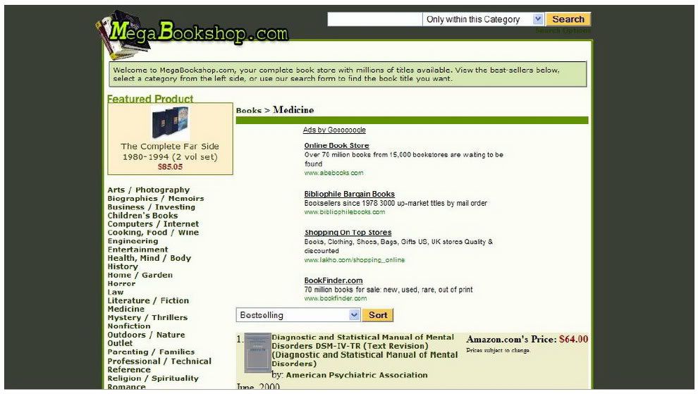
Fig. 5.2 MegaBookshop.com has a search form, a featured product, category links and AdSense ads, all above the fold.
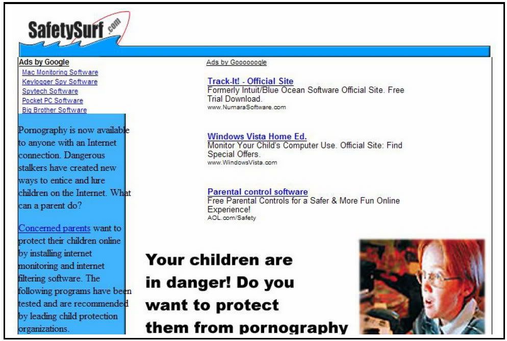
Fig. 5.3 SafetySurf.com is not the most attractive site, but ONLY has AdSense ads above the fold. Now, which of these sites’ ads do you think brings a higher clickthrough rate? You guessed it. The second site has triple the clickthrough rate of the first site. The moral of the story? If you want to maximize your AdSense clicks, give your visitors fewer choices above the fold!
5.4 Using Tables
I’ve already mentioned that one of the principles of a high clickthrough rate is to make your sites blend into the page. The more you position your sites to blend into the page, the better your clickthrough rate will be. One very neat way to help your ads blend into the site is to place them in tables. In the example below, Chris Pirillo again skillfully dropped his AdSense into a for a clean and attractive look that turns AdSense into a new focal point.
Fig 5.4 Note how clean the tables make the ads look.
Want to get the same results with your web page? Dave Taylor (www.intuitive.com) shares this simple code to create a left aligned table containing AdSense. Just paste this code where you want AdSense to appear. Easy! Leftaligned table with AdSense:

5.5 Complementing Your Ads
That’s pretty easy. But there’s an alternative strategy, which can be very powerful: bringing your users to your ads. You have to be careful here though. Google forbids you from saying to users “Look over here and click on the ads... I want the money.” And that’s reasonable. But with some clever design work, you can still guide your users to look in that direction. The rule to remember here is that elements attract eyes. When a user loads a Web page, he’s always going to look at various things on the page, not just the text. That’s especially true of images, which is why one popular
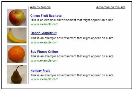
Fig. 5.5 Google says: “Don’t try this at home...” strategy was to place pictures related to the content of the ad right next to the ad unit.
Google has now got wise to that. It’s changed its terms to forbid that practice specifically. Not surprisingly, when Google brought out that rule, it created a mild panic among publishers who rushed to change their page layouts. It didn’t help that Google doesn’t specify how far images should be from the ad units. The company just says that the images and the ads should not be lined up “in a way that suggests a relationship” between them.
That’s vague enough to give Google plenty of latitude to ban publishers who think they’re doing nothing wrong. Fortunately, I haven’t heard of anyone being banned for failing to move their ads, and I suspect that you’d get a warning letter before any action was taken. So if you can’t put related images next to ads to draw attention to them, what can you do? I’ve already talked about placing a text ad unit next to an image ad unit. That’s one strategy you could use. You could also place an unrelated image next to an ad unit. Again, as long as there’s no suggestion of a relationship between the image and the ad unit, you’ll be sage. For example, at SafetySurf.com, I put a link unit at the top of the page. It’s above the side
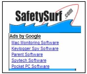
SafetySurf.com. People are always going to look at the icon. When they look at the icon, they’ll see the ads. There are all sorts of ways you can do this, but probably the best method is to first place your ads and then think about which images you can place near them. Of course, you don’t just have to use
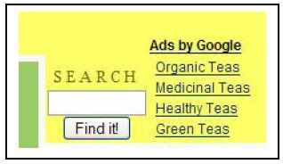
You could also use a “Submit” search box at FamilyFirst.com. button, a “next” link or anything else that users will have to look at on your page.
A search box for example is an excellent spot. You know your users are about to look for something and click away. Why not offer them some of your own options. There’s a good chance that pulling your users’ eyes in this way will increase your clickthrough rates.
That’s pretty easy. But there’s an alternative strategy, which can be very powerful: bringing your users to your ads. You have to be careful here though. Google forbids you from saying to users “Look over here and click on the ads... I want the money.” And that’s reasonable. But with some clever design work, you can still guide your users to look in that direction. The rule to remember here is that elements attract eyes. When a user loads a Web page, he’s always going to look at various things on the page, not just the text. That’s especially true of images, which is why one popular
Fig. 5.5 Google says: “Don’t try this at home...” strategy was to place pictures related to the content of the ad right next to the ad unit.
Google has now got wise to that. It’s changed its terms to forbid that practice specifically. Not surprisingly, when Google brought out that rule, it created a mild panic among publishers who rushed to change their page layouts. It didn’t help that Google doesn’t specify how far images should be from the ad units. The company just says that the images and the ads should not be lined up “in a way that suggests a relationship” between them.
That’s vague enough to give Google plenty of latitude to ban publishers who think they’re doing nothing wrong. Fortunately, I haven’t heard of anyone being banned for failing to move their ads, and I suspect that you’d get a warning letter before any action was taken. So if you can’t put related images next to ads to draw attention to them, what can you do? I’ve already talked about placing a text ad unit next to an image ad unit. That’s one strategy you could use. You could also place an unrelated image next to an ad unit. Again, as long as there’s no suggestion of a relationship between the image and the ad unit, you’ll be sage. For example, at SafetySurf.com, I put a link unit at the top of the page. It’s above the side
Fig. 5.6 One way to place bar, which is where many people put link units, an image next to an ad but it’s also directly beneath the icon.
SafetySurf.com. People are always going to look at the icon. When they look at the icon, they’ll see the ads. There are all sorts of ways you can do this, but probably the best method is to first place your ads and then think about which images you can place near them. Of course, you don’t just have to use
Fig. 5.7 A new use for a images.
You could also use a “Submit” search box at FamilyFirst.com. button, a “next” link or anything else that users will have to look at on your page.
A search box for example is an excellent spot. You know your users are about to look for something and click away. Why not offer them some of your own options. There’s a good chance that pulling your users’ eyes in this way will increase your clickthrough rates.

